
I created a data visualization of City of Seattle employee hourly salaries by department.
For my Visualization Design course at the University of Washington Information School, I used R and Adobe Illustrator to visualize the hourly wages of employees at the City of Seattle by department. I believe open discussion of wages is a moral good among employees which can help colleagues negotiate for the salaries they deserve. I also believe in holding public officials accountable for their actions, especially those in the public eye whose actions may cause controversy in their communities. Thus, I figured creating this data visualization would help me learn about the major players in the Seattle community I had recently joined.
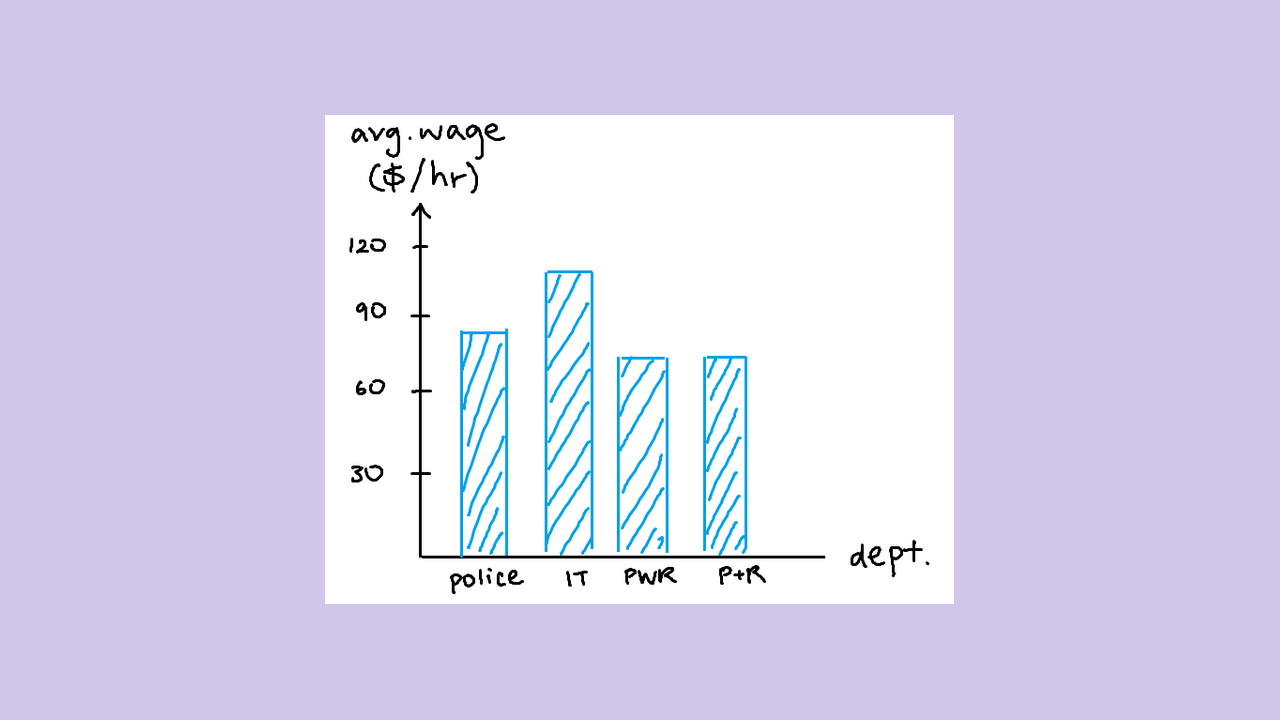
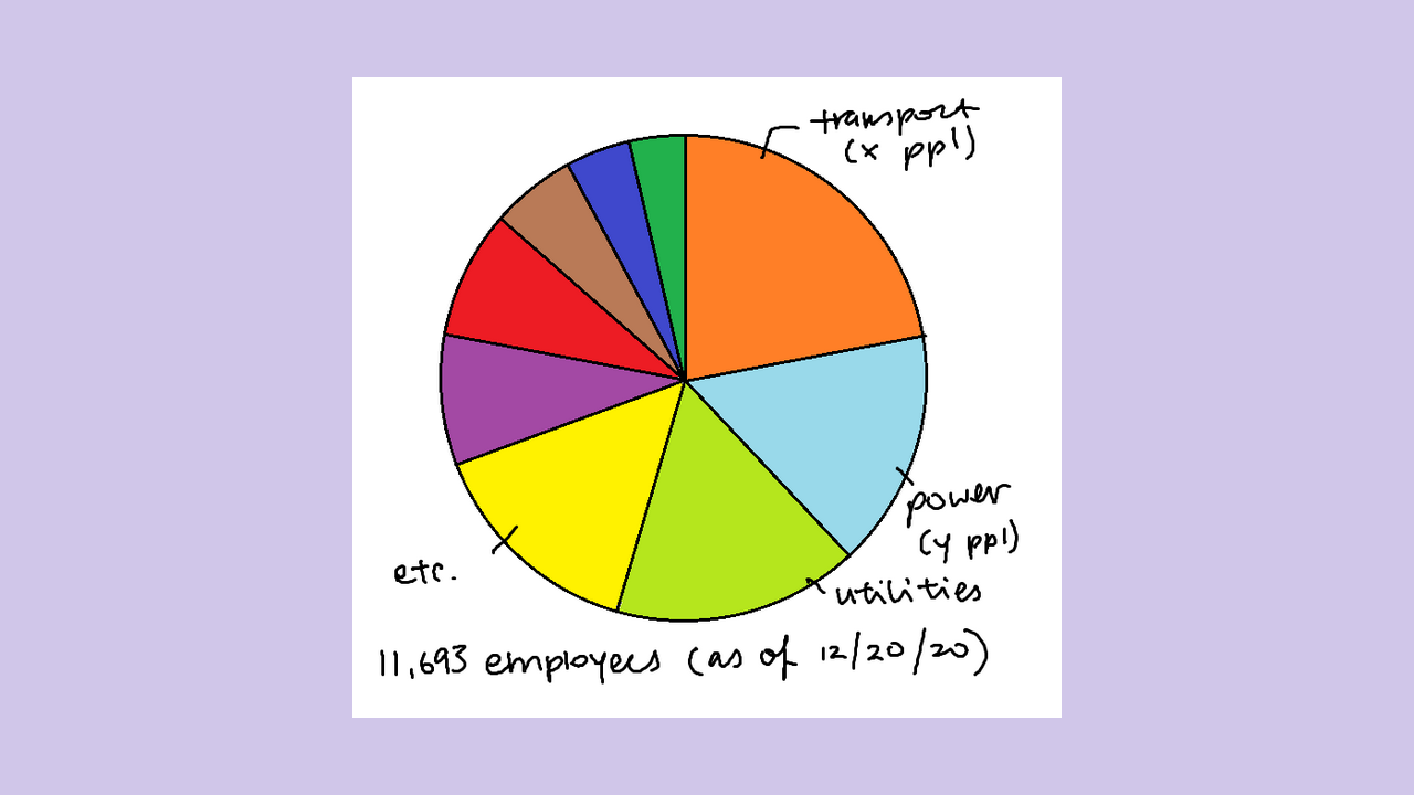
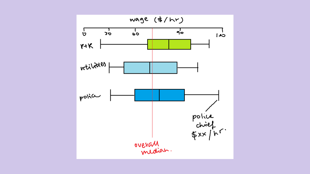
My first step was to draft different ways of presenting my data. Since I made it my goal to design for members of the general public who may not know how to interpret very specialized graphs, I ideated simple types of data visualizations that even statistics novices could understand. My MS Paint sketches can be seen below; I ultimately decided on creating box-and-whisker plots because they were able to show all kinds of different information, even if there was a slight learning curve toward interpreting them.
My final iteration of the data visualization can be seen below. It’s not perfect, so here are some changes I would make in future projects in order to sharpen my data vis skills:
- Discussing the Civil Service Commission outlier: The readers were curious why the Civil Services Commission employees are paid less than minimum wage. I went on the department website to do some research, but could not find a suitable explanation for this major outlier. If I were to work on this visualization more in the future, I would do more research on this and add a note explaining this.
- Showing department size through other visual encodings: One reader suggested other ways I could visually encode the size of each department, such as color saturation or a sort of “heat map” way to show what specific job positions were most common. I ultimately didn’t have time to include it, but if I were to iterate on this in the future, I want to explore various ways to show department size.
Here you can view the full report of my data visualization in PDF form.